Terrible Modern UI
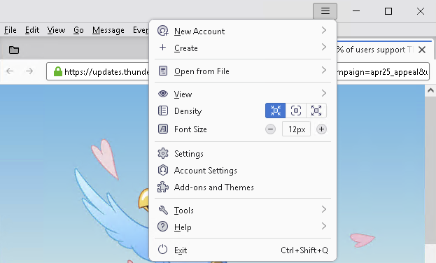
There use to be a time where the Windows UI was pretty consistent. These days it is a clusterf. Consider these two UIs from two different applications from the same vendor:
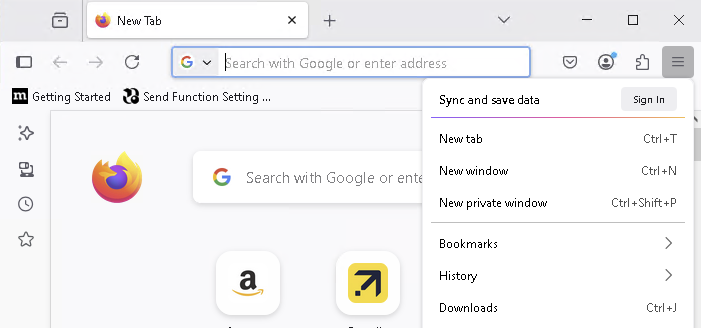
The location of the hamburger menu is wildly inconsistent - in one app it is in the title bar, in the other in the menu bar.
Here the hamburger menu looks different, and is chucked in the left corner of the title bar.
I have so many gripes with this design:
- There is no design
- There is no consistency between applications. Lack of consistency makes muscle memory worthless.
- You can no longer anticipate where an action would be located - there use to be a time when I knew to find the Open action under the File menu that will be in the menu bar, and most often be the first menu item.
- With so many things stuffed into the title bar, it is next to impossible to grab a window and move it. Try moving the Chrome browser - see image below, you only have a small 1cm square open space in the title bar to grab it.
